Freshening Up: Giving old patchers a new face in Max 5

I have to confess that I always found UI design in Max 4 to be a little too cumbersome, and would almost always wait until a patch was completely written and debugged before bothering with any layout of UI elements and color. The design process was usually confounded in the end by the fact that it seemed no matter how hard you tried, it still looked like a Max patch (for better or worse). Or, you end up going to great lengths to build a UI and unlock your patch to find a complete mess of patching. I, like many other Max users, convinced myself that I liked the old Max 4 look and that I could deal with the limited color palette and pixelation. I could just build functional patches that did their job and didn't need any polish. That was then. Now, along comes Max 5, with its more user friendly interface-building tools, and I'm starting to think it's time to put a new face on all those old patches. This article is an exploration into my process of breathing new life into some dusty old creations.
Download the patches used in this tutorial.
The Patch
The patch I'll be working with is one of those utility patches I keep lying around that I call SAMPLEWarp. It is just a simple sample playback patch with envelopes to control the playhead location and amplitude over time. Nothing extra fancy, DSP-wise, but something I keep using for assorted sound design tasks, like building drum-hits.
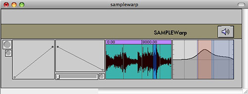
Looking at the patcher UI, you can see several typical issues that plague Max 4 patches - the extra space at the top where the object palette and supporting objects like loadbangs must go, the lack of any assistance or labeling, the flat opaque colors and rather stoic rectangular layout - all of which have defined the Max patcher aesthetic for years.
The Plan
As with any redesign project, taking a moment to create a plan of action will help us to get the type of results we want. Here is a list of things I'll want to do to get this thing in order:
Make a presentation view that is independent of the logical structure of the patch.
Use transparency and overlapping elements to give the UI a softer, more fluid look.
Clean up the readability of the Patching View of the patch
Add hints to UI objects to make user navigation easier
Use textbutton to replace mysterious UI buttons. Use a bpatcher to create a tabbed interface.
Make better looking title text using the anti-aliased font engine.
Create a transparent overlay image to obscure some of those hard edges, contribute to a more friendly tone, and add a little sparkle.
Presentation
When I open up the patch for the first time in Max 5, the patch looks pretty similar to the way it always did in Max 4, except that a couple of the UI objects have a slightly different look than they used to. The first thing I'll do is resave this patch in a new folder that I've created for Max 5 patches. I don't want to get this version confused with the old Max 4 version of the patch.

Next, we're going to unlock the patch and set to work on the Presentation view. To start, I select all the UI objects that are shown in my original interface (when locked) and "Add to Presentation". This makes each of these objects available in my Presentation layout. While I'm here in Patching Mode, I'll go ahead and rearrange some of the UI objects so that the patch logic will be more readable.
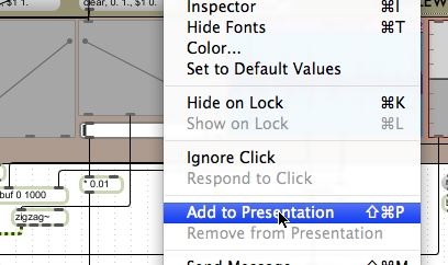
Now, when we switch into Presentation view, all the stuff I don't care to look at simply disappears. We'll spend a bit of time here in Presentation view to rearrange things and make them more presentable. The wonderful thing about Presentation view is that you can freely resize and organize UI objects without having to move your patcher around and reposition the programmatic elements. The first thing we'll do is move things around to create a new layout for Presentation that isn't so tied to patcher logic. We can also switch back to Patching mode to clean things up there and make things more readable as a program. Being able to really separate these views allows us to create both a presentable interface, and also focus more on readability and clarity when working on the underlying patch.
The Perfect Color
In the original patch, a panel object was used to create a background color for the patch. If I open the Patcher Inspector, I can choose a background color that suits my fancy and free up that panel to do something more useful. Since we're giving this patch a makeover, I'm going to choose a slightly less homely color. While I have the Patcher Inspector open, I'll go ahead and turn on the "Open in Presentation" attribute so that the patch automatically opens with our pretty interface. While I'm at it, I'll open up the inspectors for the panels and update their color scheme as well. With the title-bar panel, I'll use a vertical gradient fill with a low-alpha to give it a little transparency. Without even touching the UI objects, things are already starting to look more lively.
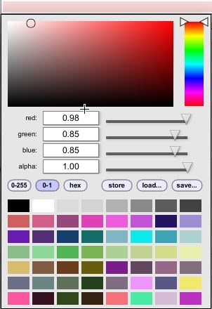
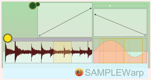
The next step of course will be to customize the other UI objects using their respective inspectors. Whereas color control was fairly limited in Max 4, every aspect of your patch in Max 5 can be fully customized to have the exact color scheme you really want. Once I get something looking the way I like, I can make that object into a "prototype" by choosing the Save Prototype... option in the Object or contextual menu. This allows me to reuse design elements in future patches without having to dig through inspector windows. Alternately, you can also select multiple objects of the same type and open a single inspector to change the colors on all of them at once. This makes creating uniform UI objects a snap. Below you can see the results of just a few minutes adjusting colors and moving objects around.
Embedded Meaning
Because I wrote this patch a few years ago, and I've been using it now and then for a long time, I don't really need many textual prompts to clutter things up while I'm working. Nevertheless, as interfaces get more complex and time passes, it gets pretty easy to forget what knob handles which parameter unless you unlock the patch or provide yourself with comments. In Max 5, every object has a "Hint" and an "Annotation" attribute, which allows you to embed little clues into your UI. Hints are used to create little mouseover hints when the patch is locked. I'm going to add some of these to my patch to make using the interface a little friendlier. To do this all I have to do is open the inspector and add some text to the "Hint" field.

I can also add annotations to my objects to provide more detailed information when I am in editing mode. This allows me to leave notes to myself about how an object fits into the logic of the patch. In the past, it was necessary to add comment boxes to your patch, which would add to the visual clutter at times. Instead, you can use annotations, which show up in the clue window when you mouse over the object in edit mode.
Next Steps
Now that we've cleaned up the patch and made it a little more presentable, we can begin to look at some more detailed ways to customize the look and feel of the UI. In the next portion of this article, we'll look at using some of the new UI objects, making a tabbed interface, and using transparent image overlays to enhance the look of our patch.
Don't forget to save your work, and stay tuned...
by Andrew Benson on May 23, 2008

