Freshening Up, Part 2
When we left off in the last article, we had created a new color scheme and layout for our old patcher using presentation mode, translucency, improved color controls, and embedded hints. We could certainly leave this patch alone, but we're going to take the interface to another level, making it a little more interactive and interesting, while providing more intuitive controls. The techniques discussed here should open the door to much more fun and useful interface designs for your patches.
Download the patch used in this tutorial.
Tucking it Away
The first thing we're going to set to work on is a nice, tabbed interface for the controls. This will allow us to simplify our layout considerably, and provide more organized control for the user. As much as I love looking at big cockpit-style control panel objects, it can be pretty distracting to have everything on a single page when your interface starts getting too complex. In order to create the tabbed interface, we'll be working with an embedded bpatcher and a new UI object called tab introduced in Max 5.
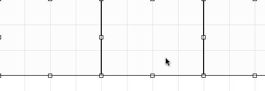
To get started we'll create a new bpatcher from the Object Palette, and set "Embed Patcher in Parent" in the inspector. By turning the embed attribute on, we automatically get a blank patch inside of our bpatcher that we can edit by opening up a New View. Right-click (ctrl-click for Mac single-button users) on our new bpatcher to bring up the contextual menu, and then choose Object->New View of "none". This opens up an editable view of the bpatcher's contents. From there, we can begin to plan out our interface. First, we'll add a thispatcher object connected to an inlet so that we can control the view offset from the main patch, which will allow us to jump to our different UI panel objects. We'll need to create three evenly spaced areas of our embedded patch to serve as UI panel objects. A good way to plot this out is to use the Grid feature of the patcher. I first go into the Patcher Inspector and set the Grid Size to "50. 50." This gives me widely spaced, even gridlines to guide my layout. While I'm in there, I'll also check Open in Presentation so that we can see the Presentation view of our embedded bpatcher when the main patch opens. Now we'll turn on Show Grid and Snap to Grid using the buttons on the toolbar.
To guide our layout, we'll create a new panel object and drag it to the top left corner. Since we've enabled Snap to Grid, it will lock right into place. Next, we'll add our panel object to Presentation view so that we can see it while we work on our UI. Now, switch to Presentation view and drag the bottom right corner to begin resizing. If you hold down the Command (Ctrl on Windows) key while you drag, the resizing will also snap to the grid. We do this to make our panel object sized in a multiple of 50 pixels. In this patch, we'll make each of our panel objects 200 x 150. Now, we'll go into the inspector and set the alpha value of our panel interior low enough to see the grid in the patcher background, and change the Border Size to "1". Now we'll duplicate this panel a couple of times, placing each side by side along the grid. If you would like to prevent yourself from accidentally moving these around, select Include in Background, and Lock Background.
Now that we have a nice guide for our layout, we'll start copying our UI elements that we want to use into the bpatcher. To do this, we go into the main patch (Patching Mode) and select the objects we want to copy and then go to Edit->Encapsulate. This step generates a new patcher object that includes these objects and has all the connections to outlet objects that we'll need for our bpatcher. Open this subpatch and Select All and Copy. Now go back to our bpatcher view (in Patching Mode) and Paste. While in Patching Mode, we can resize our layout panels to get them out of the way and organize things for readability. We wouldn't want to leave a mess for ourselves, would we? Notice that the objects we copied are automatically added to Presentation since the Include in Presentation attributes were set on the original objects.
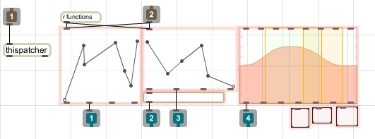
Now we can switch into presentation and divide these objects among our three panel sections. Once we've found a layout we like, we'll go ahead and remove the borders on those panel objects so they aren't visible in our patch. While we're at it, we can tweak the colors again a little bit to provide more of a differentiation between the function objects and the background panel colors for each view.

Now for the tricky bit. We're going to select our embedded bpatcher in the main patch and Copy. Then we'll select the patcher object that was created when we encapsulated our UI objects, and choose Edit->Paste Replace. This replaces the original subpatch with a copy of our embedded bpatcher and maintains all of the connections. Now we can safely delete the original embedded bpatcher.
View Control
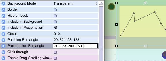
Now, even though we set the Open in Presentation attribute of our embedded bpatcher, it is probably still showing up in Patching mode in the main patch, unless you have saved and reopened the patch. While saving the patch at this point is definitely a good idea, you can also control the view by sending message to the thispatcher object inside our bpatcher. To switch to Presentation mode all you have to do is send the message "presentation 1" to the inlet of bpatcher. In Presentation mode, open the inspector for bpatcher. From there you can change the Presentation Rectangle to be the appropriate size by changing the last two numbers to 200. and 150. This will make the object the same size as the layout panel objects we created previously.
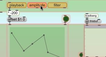
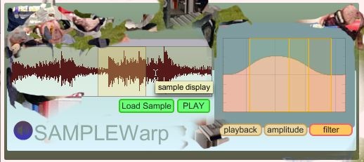
Back in patching view we'll create the interface that allows us to switch panel views. To do this we'll create a tab object with 3 items. In the tab inspector you can give these items useful names that reflect what is included in each view. For this project, we'll name them playback, envelope, and filter. Now the tab object will function similarly to a umenu object, putting out the item index that is clicked. There are several modes and ways to customize this object, but we'll leave it pretty much as-is for now. Since we went to all that trouble to make evenly spaced view panels, creating the interface between tab and bpatcher is as simple as multiplying the Tab Index output by "-200" and connecting that to a message box with "offset $1 0". Connect all of this to the bpatcher inlet and test the operation of your tabbed interface. Now we add the tab object to Presentation and resize and position it.
Helpful Buttons
While abstract little circles are very nice looking as buttons, sometimes you want something a little more communicative. The new textbutton object allows you to make a fully configurable button that displays text, can work as a trigger or toggle, and can be as round or square as you like. In this case, I'd like to replace the button that triggers a buffer~ to load a new sample with a textbutton that says "Load Sample". To do this I simply create a new textbutton, change the text in the inspector, and use the left outlet to connect to my "replace" message. While I'm thinking of it, I'll change the colors and adjust other attributes to match the rest of the patch. I'll also duplicate this button and make a PLAY button that has the same attributes.
Bringing in the Reinforcements
While there are a ton of tricks you can develop for making nice looking GUIs in Max 5, any user who really cares about appearances will eventually need to pull out some bigger ammo, and use a dedicated image authoring application to develop UI elements. One of the great new features for Max UI developers is the ability of the graphics objects to support transparency in hosted image files. This means less mucking around with mask regions of an image to create transparent knobs for pictctrl and pictslider, and the ability to make transparent image overlays using fpic.
To demonstrate, we're going to use Photoshop to create a mask image to liven up the edges of our patch UI. The first thing we'll want to do is take a screen shot of our patch to work with. We then open our screenshot in Photoshop to begin work. Once it's open, create a new Layer, and begin drawing, cutting, pasting, and clone-stamping until you've got something you like. In this example I've used the clone brush with a bunch of different images to design a clustered look around the edges of the UI elements. One technique I like is to use a soft-edged eraser tool to selectively soften and manipulate the edges of the overlay image. It's all about inventive use of transparency. You could certainly make something much tidier looking, but I'm not a very tidy person. Once you feel happy with your overlay image, delete the background layer that had our screenshot. You should now see our overlay image with a transparent background. To finish, save the file as a PNG somewhere in the Max 5 search path. The PNG format allows you to save transparency information that MaxMSP will use for drawing in the fpic object (and other graphics UI objects).
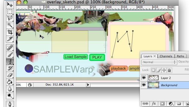
To apply this overlay image to our patch, all we have to do is create a new fpic object and load the image. In the inspector, you will want to check Ignore Click so that our other UI objects will still function as expected. Since other UI objects also support the use of transparent PNG files, you can easily create your own custom knobs and sliders as well. If you need to adjust the locations of your UI objects, you can simply send the overlay to back (Arrange->Send to Back) before you do so.
Finishing Up
As you can see from this series of articles, Max 5 has a ton of useful new features that allow you to create interesting and dynamic user interface designs for your Max patch. I encourage you to explore all of these new features and take some time to really personalize your patching aesthetic. If you come up with something you are proud of, make sure you share your results with the rest of the Max community! Happy Patching!
by Andrew Benson on June 30, 2008

