
Dialogics (i.e. the fine art of dialog)

Why is the MAX logo included in the dialog object? It just takes up real estate, adding substantially to the overall clunkiness of the dialog window.
It did not really distract me when the logo was smallish and b/w-ish and on the left of the input box, in line with the writing direction. However, in v.9 it was inflated and colorized and, worse, placed ABOVE the input box. Top Center! Totally distracting!
The dialog GI was always a bit of an eyesore to me. Somehow the colors don't fit my preferred styles. But life is short and there were tons of other more pressing things to work on, so I lived with it for years. Until the logo moved in 9.
It was the straw that broke the camel's back, the drop that spilled the bucket.
After duly checking the forums and coming up clueless, I contacted Cycling's CS, inquiring whether the logo could be moved back to the left, or, preferably, removed from the dialog window altogether.
The graphic seemed external - and therefore replaceable - because I used an 8.7 dialog object in a 9.2 patcher and its logo showed up top center anyhoo.
I was hoping a yes would also pave the way for other graphic alterations.
But no. They suggested I'd file it as a feature request, which I did. Look for it.
So far, I found exactly one alternative dialog object - details upon request. The styling is alright, but it tends to freeze, necessitating forced quits. However, it came as a patcher, not as an MXO and could be modified easily. Which I did, retaining the essentials and building my own version on those. Thank you, François Weber.
Here's the result. I rather unimaginatively called it xdialog, but that can be changed, as well as much else about it. As it is, it is as simple as I could make it. It is encapsulated in its mommy below.
[Whoa! Patcher under development; forgot a few tees. But here's a preview:
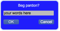
Watch this space!]