
Radar chart for realtime descriptor visualization?

Has anyone built a Radar Chart in Max?
I'm wanting to build something that will take an incoming stream of descriptors/values (likely 4-6 or thereabouts) and plot them in some way, and I was thinking that this would be a useful way to visualize and compare (if multiple streams are overlaid).
I've not built this kind of thing before and although it looks fairly straightforward I'm not entirely sure how to make that.

Here's an approach...
<edit> mesh defaulted to points, set it to line_loop
Super useful! The various @draw_modes are great too. I think polygon is what I'm after. Will go away and play with this.
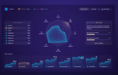
Glad i could help. And if you want mimic the chart from the image you need a combination of meshes. A seperate one for the line, points and polygon will do and some gl effects to make it look fancy
I started playing with that a bit, but I wasn't sure how to do gradient-y stuff. I don't necessarily want to do something exactly like that chart in the screenshot, but having something that looks a bit swish is always welcome :)
Totally forgot to respond earlier! I guess you can achieve the gradient stuff by either putting a texture in the background and use transparency or draw it in gl as well. Using a texture will be cheaper ofcourse.
As for swish, maybe try one of the supplied shaders with gl.pass? It seems to be a bloom-effect, not sure how to handle the increased brightness around the lines though