
Too many bars on the forum

I appreciate the discount info and links back to the homepage and all, but the forum is starting to look like a web browser in the early 2000s when you get infected with malware and had all these extra toolbars installed.
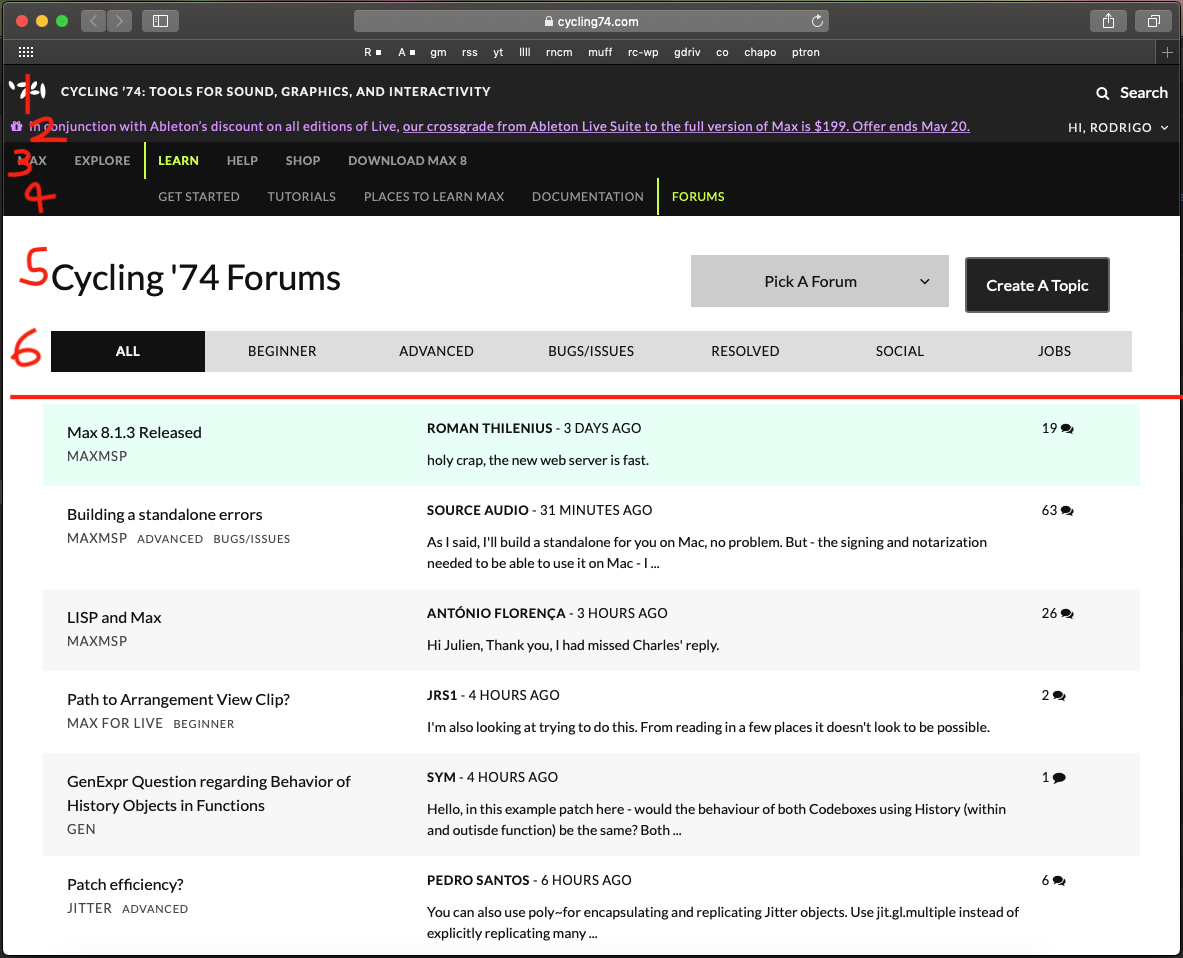
There's 4 layers of information above the actual forum 'container', and even then, there's a ton of whitespace and huge rows before we get to the actual posts. If you don't count the pinned post, around half of this browser window is "not forum"!

I understand and partially agree with your assertion, but in the early 2000s it was much worse ;-)
Optimized for Internet Explorer, 800x600 resolution rings any bell?
Website headers with big logos and navigation menus using frames (now deprecated in HTML5) meant that when you scrolled down, all of it remained visible... Real audio/video and later Flash... Those were the times...
OK... I'd better stop!
Shh, don't give them any ideas! lol

december 1st of 1998
https://web.archive.org/web/19981201224932/http://www.cycling74.com/
when mrs. support-lilly was hardly legal and the zl beta came from 68k to PPC.
any questions?


Literally laughed out loud. You're not wrong, it's looking a bit too "SourceForge" (have you been there lately? OMFG. Some of the CCRMA stuff is on there and it's like myspace or something).