
The Forum Feedback Thread

By now there's a million posts on the forum reacting on its design changes (almost as many as on Max 7 UI design?). Most of them have concealing titles like 'Congratulations'. I propose to give all feedback in this thread right here, so Ginger and the C74 crew have one place to look at for finding out what we think of it. Please make it constructive.
I think the newly introduced labels are helpful but having them right under the topic title in the listing impedes glancing over the topics to quickly check for the ones that interest me. Too much visual information to process. I’d prefer the labels to be in their own column. That ‘d improve the readability of the topics listing.

Hi, DTR! Thanks for the round-up effort! Much appreciated.
I'm making this a sticky topic!

http://www.google.com/design/spec/material-design/introduction.html
please !!! its not because of G....E . its because its well studied and provided .

I kinda like the new changes, but also agree that a repositioning of the labels would be helpful.
Personally, I would love for C74 to revisit the theming of the code blocks. I think having code blocks themed is a great idea, and quite necessary for forums like this where we are often sharing bits of code, however, the font chosen and the color of the text (green) should be revisited. I often find it hard to read the text in the code blocks, and have to resort to copying the code to a text editor for clarity.

I wrote this in one of the other topics, so for consolidation purposes here it goes:
1- Regarding this tagging system, I think some words need to be clarified:advice – to be used when seeking for advice or when giving advice?help – to be used when seeking for help or when helping?
After seeing how people are using these tags, it seems clear that there are doubts on what they're referring to... There are words you can use that don’t carry this ambiguity, like "contribution" and "doubt" or "question".
2- I do miss custom tags. I did tag my own opened topics and I seem to remember that any forum member also had the ability to contribute and add tags to any topic… that was useful, together with a comprehensive search system (which we also don’t have right now).

If you look at the top of this page, you'll see a much more readable version of how the tags could work. Larger text topic, preferably in a high contrast combination of colors, as opposed to mid-grey on mid-range pastel color. Under that, you've got a much smaller font with the topics with a readable white on colorfield. They stack to the right, so as not to take up additional vertical space in the forums.

+1 for repositioning the labels

Hi @GINGER
this is a feature suggestion that is unrelated to recent changes. It would be great to offer the e-mail follow up option also without having posted in a thread. There are situations where I stumble across interesting threads that are for me personally "off my own agenda" - i.e. because it it not my field of expertise - but i am very interested in the discussion. Currently one needs to write "dummy" response or manually check the forum to be kept in the loop.
Cheers,
Jan
Hi Jan,
You can subscribe to any topic without having to post a reply. On the top of any topic page, where it says "Favorite, Subscribe, Reply", if you click "Subscribe" it should pass along the info. The text will turn into "Unsubscribe", which means it's been turned on.
As I type that, I realize that this process can be more obvious. Will work on the interaction. But the feature is definitely there! :)
ouups... it's not that hidden either ;)

I really miss an "advance search" function, with the ability to limit the search in a particular forum (Maxmsp, gen, jitter...).
Something just like any other forum out there, for instance http://www.native-instruments.com/forum/search/
The search function in cycling74.com is way too limited, at the moment is not even possible to get the results in chronological order...

+1 for the advance search function!
but I really miss a decent way of sorting information in the share section.
The reconfigured look works great for me. No teletubby issues, and I can quickly parse the topics without any stumbling blocks. Thank you!
Could we have a search field on all forum pages so we don't have to click 'search' to get to it?

I believe the subject of the thread should be highlighted to attract most of the attention, while the labels should visually recede by comparison. As it is now, I find it visually confusing.

I agree with above, might be nice to have the titles in bold. Also, whilst it nice we can click on the tags, would also be cool if we could click on the forum names to take us to that forum also, rather than having to go back up to the top and select from the dropdown...
other than that, looking really good
@GINGER
Hi Ginger, I tried to send a bug report yesterday, but didn't receive the usual automatic confirmation e-mail. I tried today again (double checking that may e-mail was entered correctly) same result. Could you check if the report arrive? Even if they did, I cannot send the addition support file illustrating the bug.
Thx,
Jan
Hey @Jan. A perfect example of the benefit of direct/private messaging. :)
I'm speaking with support right now to see what's up. I will send you an email directly when we figure it out.
Hi Ginger !
taking in consideration that our new TAGing system will stay forever
would u consider providing some sort of [SOLVED] tag ?
that will be much more helpful than changing Thread title . Also not many people wants to do it at all while their research got succeeded or problems were solved , maybe that would help in some situation for the future . just a thought !
@GINGER hahaha, quod erat demonstrandum!
thx.
Hey everyone,
So a few updates, so hang on to your hairnets.
- The forum main page has been adjusted to have the topic titles more prominent than the tags. Nothing too major, but the colours are also now a bit lighter to address the "teletubbies" issue. :/
- We've also added a simple direct messaging option. You'll notice a tiny icon underneath user profiles now. This should allow you to start creating topics with a specific user, and they will be invited to participate via email. You can opt out of this in your profile section, if that's not your cup of tea.
Thanks for the input, everyone. We're still working on other features to implement, but I'm looking forward to hearing what you think so far, with these changes.
Oh, also, the "favorite" and "subscribe" features have also been updated. Hopefully these action items (found at the top right corners of each topic) are a bit more clear.

Thanks Ginger for dimming the Painted Ladies, much easier to see the topics now.
does this forum have any kind of moderation? I have seen some questions get asked here recently where the poster has obviously spent 0 time going through the Max tutorials or help files and ask painfully basic questions. Maybe it would be nice to be able to flag some topics as "resolved" or "read the help files" so we can at least not waste time clicking on and reading these topics? Having these sorts of topics peppered around IMO just clutters up the forum and search results with useless information.
Maybe at least a "read this before posting" sticky thread detailing some basic internet etiquette?
Also in terms of looks and design, the 1px difference in height between the [maxmsp] tag box and the other tag boxes drives me nuts, also I'd do away with the 1px gap between them but that feels like a more subjective opinion

Thanks for the new favorites and email alerts buttons ! Sometimes more words are just what we need :)
Also i strongly advise against your moderation suggestion, Jdudeo : with time, it is more and more difficult to discern what is "easy" to get from the documentation from what has been learned and integrated with time. I think non-enlightened people need learning, and a wall in front of them with "DO THE TUTORIALS" carved in letters of fire is the last thing they need - well of course it's a useful reminder, but not in letters of fire.
though i understand why, sometimes, it can get unnerving

thanks for the improvements, but I cant use the new community menu. There appears to be no way to edit or access my tool submissions, and please could you at least add hover tooltips
You guys are bringing up issues as I work on them. Mind readers, all of you!
That px bug has been fixed. And the forum tags should now link to specific forums.
@Jan, I am actually working on that specific feature, to ping users to participate in an existing topic. Stay tuned.
@Ernest, I *just* pushed change that shows an "edit" button in the sidebar of posts. This allows you to edit individual tools/projects/submissions on that page. Can you expand more on your suggestion for adding hover tooltips? What sort of tooltips were you thinking of adding?

Hi!
Would be nice to have permalinks (with hash) to forum answers, so we can share the link to specific answer not just the whole thread.
Best,
Eugene
there was no text showing up under the community toolbar icons, and they were all crunched up on the left in a narrow container, but today for some reason its back to the way it was before, thank you for your work.

Hi!
There is no way to attach a .gendsp file: “Sorry, this file type is not permitted for security reasons.”. Example: https://cycling74.com/forums/gen-zero-crossing-counting-sharing-is-fun/
Best,
E
Hello Ginger ! i have a feeling that https://cycling74.com/forums/dict-issue-help-please/
the code tags doesnt look nice anymore . Ive enjoyed to read and paste code on the forum but now its much harder to read it , at least for me . Can u take a while for it ?
Hi, Do...While,
It would help me out a lot if there was more detail about your request. What exactly about the code tags makes it "not look nice anymore"? I've reduced the font weight, so it's not bold anymore.
But for you, is it because of the colour? The tabs? The font?
Do let me know.
Hi Ginger ... Now its readable ! Its really good Ginger ! Thank you . but those are pre tags right ? just inspected it .
#EDIT : before the font was too weightly for the area , and the code was spread in a not readable way . the colors are all fine Ginger !
Awesome. Yes, those changes apply to the pre tags, as those are the ones that deal with the multi-line code.
More small updates:
Hashtags to post replies are now enabled, so for example, when you click on any link under the "Freshness" column (for a topic that has a reply), it should take you directly to the last posted reply.
You should now be able to upload
.gendspand.genjitfiles.
We can now search the site directly from the forums pages.
I'm sure this will sound redundant to some, but I'd also like to highlight that once the search term is queried, you can filter through different labels. So for example, if you just want to search "linux lollipops" within the forums, you can isolate the search to forum topics and replies only.
Hi, Ginger, the search in the forum is great.
Would it be possible to have the result in reverse chronological order? For instance if you search for "metro timing" and select forum posts only, the first post you get is from 2006... then you have posts from 2013, then 2009 and so on, with apparently no logical order.
Thanks for considering.
Hi Maurizio,
Thanks for the suggestion. I've updated the search settings to allow for either sorting by "relevance" or by "date". I've also made a few smaller changes in the metas (in hopes of returning more relevant results), but we'll probably need to wait for Google to crawl through the site to get things settled.
Ok, nobody go crazy.
We can now preview the latest posts from the forum homepage, which we hope may make it easier to skim through the conversations and see what's up.
i like it :D but the margins (both horizontally and vertically) become maybe too much - there's a lot of white space - and the "last post " column could be bigger
(2cents)
Ginger, it is perfect, thank you.
Now if I search "metro timing" the first result is my previous post in this thread :)
The search improvement is a welcome feature. just to let you know, email messages started showing up from 'cycling$#039;74'
Thanks so much for the feedback about the little bugs.
Editing a post should now be back and working
Email notif names should now be from "Cycling 74"
@Vichug, I
;D
I know! I fixed that! Faster, Google, crawl, crawl! sss...

The "latest post preview" is a great idea, but it wrecks mobile browsing. Text gets scrunched into a long narrow column on the right. Might be better if the post showed up underneath the topic & tags, at least for mobile browsers.
CSS is borked again (edit - looks OK now)
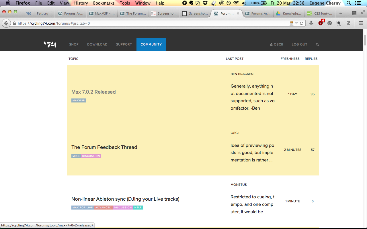
Idea of previewing posts is good, but implementation is rather bad. Preview should disappear in mobile view or it should be placed neatly under the forum title. Now it is almost impossible to view the forum from the smartphone (Fig. 1).


In the standard browser view new preview feature tooks a lot of vertical space — I have Macbook Pro 13 and now it is only 3 forum topics visible on the whole screen! It is so ANNOYING to scroll forum page down… Please, consider saving vertical space, for example, like on the following picture:
Last but not least, please return a basic forum feature of referring to the posts in threads. You already have everything in forum's HTML (I mean post ids), there is no big deal to make a post date be a link pointing to the post. Here is an example of such link that is already WORKING (now I need to dig into HTML of the post to compose it): https://cycling74.com/forums/the-forum-feedback-thread
Best,
Eugene
And this is how the forum main page looks on my laptop. The interface is VERY cumbersome.
Hi Eugine,
Thanks for the screengrabs. That last layout looks odd to me. I see that you're on Firefox on a Mac. May I ask what version you're using?
Re: mobile layouts, I will push some fixes soon.

Having the same issue with Firefox on the Mac. Version 36.0.3
Hm. I'm unable to reproduce these screens on my end. I have the same specs, FF 36.0.3 on Mac.
It could be a cache issue as well. Sorry to ask the eye-roll question, but have you tried doing a hard refresh on the page?
That did the trick for me Ginger. Thanks.
Great to hear, Jesse.
Eugine, I am still having trouble reproducing your screengrabs. I also notice that the Fig 1 image you posted looks like a resized browser window. Can you please try checking on an actual mobile device and let me know what you see?
I'm attaching some screens of what I see on my emulator tools, for your reference.

Hi Ginger,
I have Firefox 36.0.1.
It seems the problems are fixed now. Maybe old styles were cached by a browser.
On Firefox Android everything looks good.
Thanks for your work!
Eugene
Thanks for bringing the search field back to the front page! Really missed that one...